
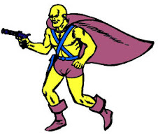
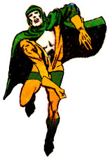
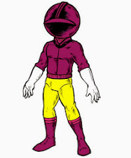
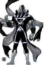
After getting a B'rett commission from The Red Wing illustrator Nick Pitarra, we talked about my sending him a scan to color. A month later, I finally got around to it, along with my retina burning Windows Paint "color guide". Less than twelve hours later:
"Frank! Thanks for taking the time to scan it in! Here's a quick color mock up for it....just a simple sloppy cell shaded thing with my morning coffee. Hope you dig it!"
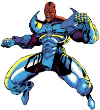
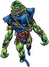
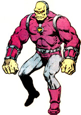
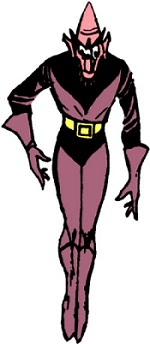
I immediately had to figure out whether to run my coloring job as a Charles Atlas sort of scrawny ugly before to Nick's buff beautiful after! Looking at his coloring, I understand why I should not only be barred from ever considering such a thing professionally, but even as an amateur it's as bad of a combination as spaghetti straps and bacne. Regular readers of my blog already know this from my previous efforts, and only allow me the indulgence because, once again, it's usually my coloring on a Martian Manhunter piece or no coloring at all. Thankfully, coloring only ranks above lettering as a job I would least want to have in this industry.
I look at Pitarra's bold, over the top style and try to match it with DayGlo vulgarity. As an artist, he recognizes the need for balance, countering the bigness of the art with muted tones to ground the zaniness of B'rett in reality. Pitarra thought about how the light should strike the figure to give it more weight, and contrasting the colorful subject against a slate background, instead of forcing him to compete for survival with an all-devouring lime green blob. It would never have even occurred to me to treat the swirls coming out of the gun barrel like color holds, and instead I took the uglier and more time consuming route of creating an outline to separate the swirls from the background. Sometimes, it's a simple matter of having the right instincts, which are all over Pitarra's take and absent from the very genes of mine. I would vastly prefer to leave something like this in his capable hands.
Enough from me, though. Let's let the artist discuss his process...
"It's like we talked about at the con...you have guys who just kind of don't care and say pay me and I'll draw it. But for me it's ...can I make this cool? Will you like it? Plus your passion and interest in the characters you commission kind of rubs off...that mojo or whatever you call it is infectious...and the reason I like to draw. It can also slow me down though...if I'm not feeling it...I'd rather take my time to make something look good than to hand in something disappointing...
Frank you give me too much credit! I just always dig pastel colors......sea foam green was my favorite crayon as a kid. As an artist who inks his own work...it's hard for me to let go of the lines in my art...so when I color I just purposely go more muted to preserve the lines...
Rachelle Rosenberg...the colorist on The Red Wing with Me and writer Jonathan Hickman does just absolutely beautiful work. She has a real feminine pallet that's so gorgeous. Like I said in our last email...she'll do things I wouldn't try, but it always comes out so cool. You gain perspective when you see others color your work."
The Red Wing, published by Image Comics, is scheduled to ship on July 13th. I already ordered my copy! For more Nick Pitarra art, visit his blog!


2 comments:
I wouldn't have thought of using pastels, either. I'm really liking the periwinkle-ish shade used for the cross-straps, too. (And the color of his gums is perfect.)
That is beyond awesome
Post a Comment